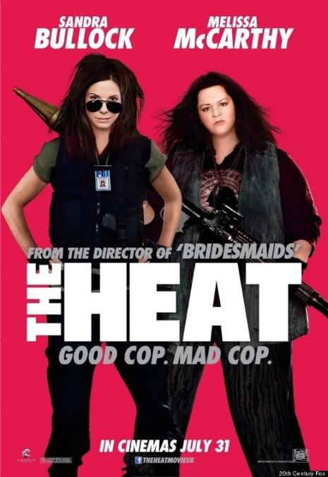
WHY? Why did some knucklehead feel the need to photoshop Melissa McCarthy’s neck and face in the poster for her new movie “The Heat” with Sandra Bullock. After all, this isn’t the cover of Vogue. Melissa’s fans are perfectly happy with her looks, but she is barely recognizable on this poster. Melissa hasn’t addressed the issue yet, but we expect her to make a joke of it.
Photo via: Huffington Post

Her head is totally out of proportion to the body. It looks weird. With all the money spent to promote this movie, you would have thought they could have spent more than $5 on the photoshop.
so minus 80 pounds?
…………..PHOTOSHOP CAN DO IT!!
I think Melissa is darling and to air brush her so you can’t recognize her is ridiculous!
it’s just a bad example of photoshop work.
photoshop doesn’t actually DO the work, there are talented and not so talented techs who use the program to create the images of perfection we see published.
The bigger question is why did they photo shop Sandra Bullock to look like a white Whoopie Goldberg?
Melissa looks like Rosie in the photo.
Sandra does nothing for me. Can she just go away.